Basic Editor Controls
Names and Functions of Each Window Component
The screen which appears after opening a project is called the "Main Window". The Main Window is primarily used to edit the map and events. Tools such as the [Database] are opened from the Main Window menu. The functions of each component are as follows.
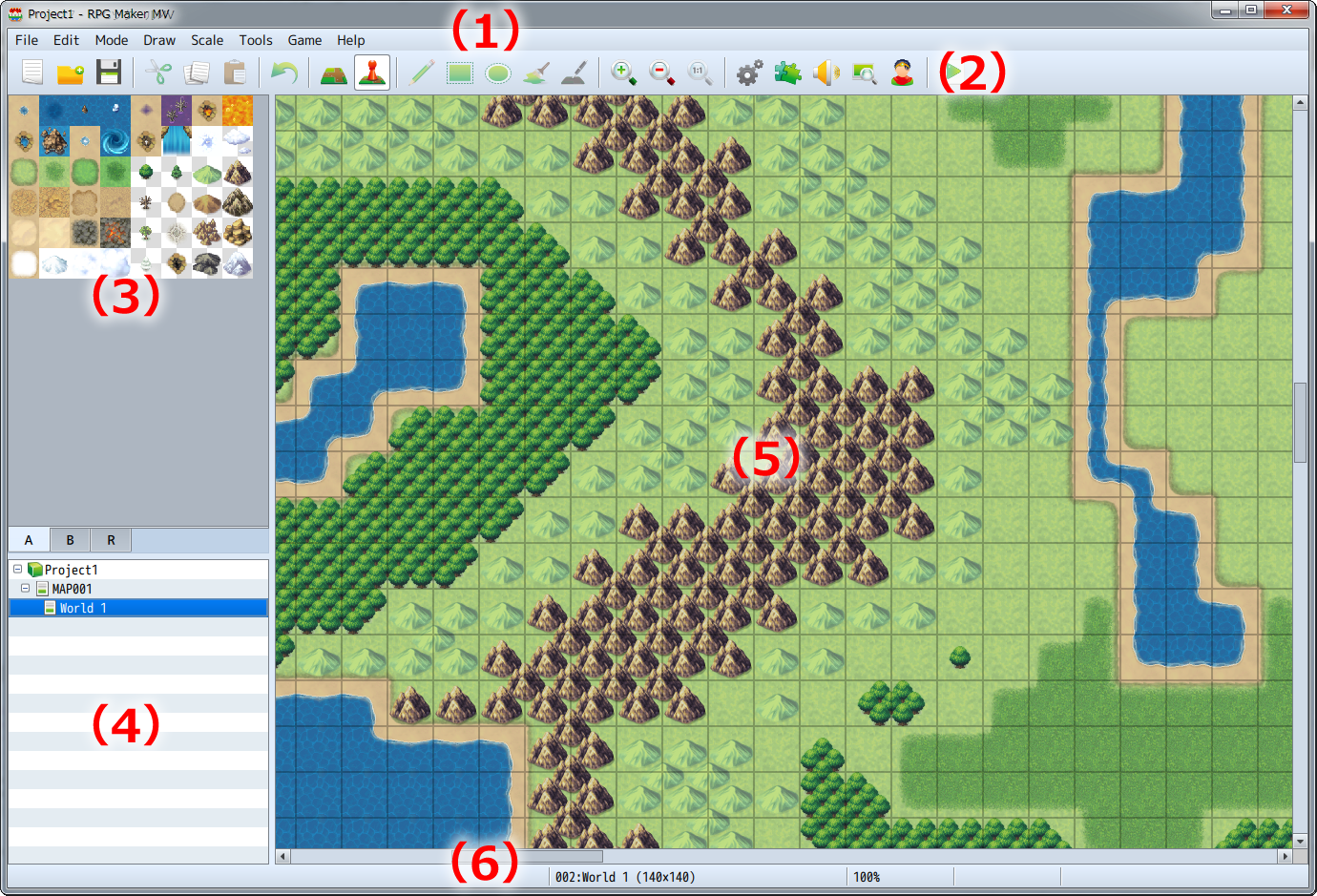
- (1) Menu Bar
- Functions available in this software are selected from here.
- (2) Toolbar
- The specified function can be run from clicking its button.
- (3) Tile Palette
- Tilesets which can be placed on the map are displayed here. You can switch to Set/Region Editor Mode using the tabs below.
- (4) Map List
- A list which shows Map data included in the game currently being created.
- (5) Map View
- Displays the contents of the map that is currently selected. It is used for things such as editing designs and specifying placement of events.
- (6) Status Bar
- Displays details of the function that is currently selected, the map name and map coordinates.
Editing Parameters
Adjusting the parameters available in the various windows of the things you want to make, and specifying things such as text and items is at the core of the creation process when creating games using this software. The different types of items you can set and how to edit them are as follows.
- Input Text
- When you click on the settings field, the "|" cursor is displayed. Input text using the keyboard in this state. Text will appear at the location of the cursor. You can also move the cursor using the cursor key on the keyboard. The method for entering text differs depending on the input software (IME) you are using.
- Input Values
- Just as with entering text, when clicking on the parameter field, the "|" cursor is displayed. Input values using half-width characters using the keyboard in this state. By clicking on the [∧] and [∨] buttons located to the right of the settings field, you can increase or decrease the values.
- Radio Buttons
- Select one item from a list of multiple items. By clicking the [○], the item which contains the black dot is enabled.
- Check Boxes
- Enables/disables the parameter displayed next to the parameter name. By checking the [□], that parameter becomes enabled. Clicking once again removes the checkmark.
- Pull-down List
- Make a selection from items displayed in a list. Clicking the [∨] arrow located to the right of the settings field opens the list.
- List Box
- Display multiple settings in a list. You can add details and make changes in the window by double-clicking an item.
- [...] Button
- Details of items which have a [...] located to the right of a settings field are specified in a separate window. Click the [...] and set your parameters in the window that is displayed.
- [OK] [Cancel] [Apply] Buttons
- By confirming the details of the settings which you have changed, they will become effective. Clicking [OK] finalizes these settings and closes the window. Clicking [Cancel] discards all changes to items and closes the window and clicking [Apply] confirms settings without closing the window.